Do you know heatmaps contribute to your website success and help you generate more conversions? In this article you will learn about how to integrate heatmaps to your website to boost more business leads.
Analytical tools are paramount if the success of your business is at stake. Whether it is an advertising campaign, a development plan, or even a complete marketing campaign, ex-ante and ex-post analysis is essential.
Do you want to know how effective your campaign has been, or perhaps how your visitors are using your website? Now we will show you how to use one of the most popular, innovative data visualization tools, the heatmap, which can provide answers to these questions.
What is data visualization?
The easiest way to describe data visualization is as a visual or graphical representation of data. Now, surely you think, well, I have known this so far, why should I read another boring article? The answer is simple because that is not all.
With the advancement of technology and the ever-expanding range of tools used in marketing, data visualization is no longer just a simple diagram. While traditional tools are still very popular, we encourage you to take advantage of new opportunities, dare to cut into something new, as these newer tools provide much more useful information.
There has been a lot of talk about the new tools, but what could they be? Let us see some new opportunities:
Heatmaps
In our opinion, it is one of the most useful tools. Heatmaps provide excellent data if you want to increase your conversion rate or possibly improve your website by showing you what are the most frequented and the least visited parts of your online store.
The use of heatmaps is in its heyday today, with 70% of online businesses using such a service regularly. Statistics show that businesses that use such a tool have been able to increase their conversion rates by an average of 9-11%. This means that using this alone, they were able to sell 1.1 times as many products as before. To bring specific numbers, a business that realized $ 10,000 in revenue could have made a profit of $ 11,000 using heatmaps.
Heatmaps use warm and cold colors where warm colors indicate the frequented and cold colors indicate the less popular places on your website. And even their use is easy, isn’t it great?
Eye camera
An eye camera is used primarily for research, but it can be a good way to examine your subjects’ attention and thereby assess which items are the most attractive on your website. With this method, you can observe the movement of people’s eyes, so you can place your ads or other promotions in the most appropriate place with this information in mind, and a well-placed ad can increase your conversion rate.
The camera records the percentage or numbers of the subject’s viewing. It is really useful data, trust me. The only downside is that you have to buy this camera and the people surveyed have to show up in person at your research.
Replays
Replays share a very complex set of data with you, as you can trace the entire sequence of visitors’ actions with them. You can see what they chose, how many and in what way.
By using replays, you can excellently improve your customer experience and it also plays a prominent role in increasing sales. Websites that use this tool in their website development say that barriers to their conversion funnel are almost 100% gone, making it much easier for their customers to make purchases. And a jam-free conversion and sales funnel can mean increased revenue. That sounds good, doesn’t it?
Unfortunately, they do not provide a specific figure, but we think this information is plenty enough to confirm that you should use such innovative data visualization tools.

The secret of the increased conversion rate
The relationship between data visualization tools and conversion rate has been constantly revealed. Remember that for your business to be successful, this is one of the most important indicators you should monitor regularly. Here you can read about the relationship between conversion rates and the use of heatmaps.
You already know how heatmaps work, but let us look at an example of the benefits of a website that uses it over someone who stays with traditional devices:
Suppose your goal is to increase your conversion rate. Using traditional – but we have to add that not bad – tools, it will take 3 times as long to get the relevant information. You will either need to send a circular to your visitors with separate questionnaires, or people may have to appear in person in the survey, and then you even systematize and evaluate the extracted data.
It is even long to describe this process. It would go much faster and more efficiently as well. Using heatmaps halves this procedure, as you can specifically see problematic or high-performing items on your website, you do not have to call people in person, you do not have to evaluate the data for your business, you have to simply evaluate the results and swing into action.
To increase your conversion rate, there are 4 things to consider:
- What are the best performing CTAs on your site?
- What are the most frequented places on your site?
- How do visitors use your site?
- What are the elements that are eye-catching on your page?
You think well, these questions are all answered by heatmaps.
The boosting campaigns
Let us get to the point. Your goal is to increase your conversion rate. How can you achieve this with just a data visualization tool? Believe me, it is very simple.
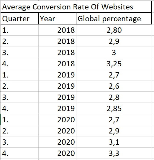
The average conversion rate in the online industry is between 2 and 4%. The goal is to get this ratio as high as possible but remember, always compare this percentage to yourself, as it may be that a rate of 2.3% is already outstanding for your product or main activity, but in another area, it is a tragic number.
Let us see how you can increase this number with heatmaps:
- Preliminary preparations
You have a goal; you want to increase this indicator. However, beforehand, it is important to consider what you want to focus your survey on? Looking for the best CTA? Perhaps the most eye-catching color? You need to be aware of these, as without them you will only see meaningless colored spots on the screen.
If you accept our suggestion, you will not only grab one item to be examined from your website but more. By this we mean, for example, examining 2-3 pieces of CTA, or combining a call-to-action with color and location. You can easily extract this data with the help of heatmaps and it will be of huge importance later.
- The analysis itself
Focus on the previously selected elements. During the test, you need to pay attention to which elements perform best. For heatmaps, you will see this as the device will mark well-performing items with warm colors (red or orange).
All you have to do is collect the best-performing items in a spreadsheet or just note them down and then look for the most appropriate combinations. The service does everything else for you, no counting, minimal chance of error.
- Conversion boosting
We got to the point, that is what you were waiting for. Once you have your details, you can start the campaign. In order for your conversion rate to increase, you need to consider the top spots on your page and the highest performing elements, such as CTAs, colors, motifs.
Here we turn back to what we suggest: not just select one item but combine them. Use the best text with the best color or even any combination for which the heatmap has given positive feedback.
When it comes to increasing your conversion rate, there are 2 things that can come up as a solution:
– An ad placed in the best place with the best items
– Increase user experience
We would now like to focus on ad placement, as this is sure to increase your conversions, and UX development is more of a subjective part of this process, but heatmap analysis can be a great solution for this too.
Ad placement
Try to place your ads in a high-frequency location. This is necessary because it will surely show up to visitors who are more likely to click on it, thus increasing the number of your purchases.
Remember, it does not matter what your ad looks like. If the heatmap analysis shows that the blue color is the one that attracts the most attention, make sure it dominates. We add that it is also important that this ad fits your business. So, if it turns out that the only little red part performed best on your website, even though your image is built on blue, do not use red, stay with blue.
Such errors can occur, as a very different element on the page will inadvertently attract attention, even though it is of no use in reality. But what if you see that none of your CTAs have done well? The answer is simple, replace it. Basically, the success rate of a conversion rate is determined by a well-chosen call-to-action of 60%.
Breakaway from the old “buy it” type CTAs in this case. Use “I visit the site” or “I try it for free” innovative texts.

Summary
With a wide range of newer data visualization tools, your sales have no longer a barrier to growth. With the help of heatmaps, it becomes easy to perform further analyzes, be it an A / B test, since the elements to be examined are already in your hands.
According to statistics, the use of data visualization tools has allowed online businesses worldwide to increase their conversion rates by an average of 12%. Do not miss out on the good.