Call-to-action buttons (CTAs) are very popular when it comes to converting raw visitors to a paid customer or valuable subscriber.
When you visit a website & at the corner, find a flashing red button with the text “Download Now,” which is an example of a Call-to-action button. Using this button, you increase the chance that visitors will take action; maybe it is a download of an eBook or subscription to your site.
Therefore, the Call-to-action button is very useful. However, how it should be implemented in a website is still a matter of debate. Some experts believe red color buttons draw attention, while others say color doesn’t matter but where you place it. In my opinion, there is no fixed solution for it. It’s all based on your audience types.
Anyway, in general, the CTAs click-through rate should be around 3-4%; therefore, if your click-through rate is lower than this, it is time to improve the performance.
If you want to learn how to do it correctly, you have come to the right place. Read my guide; here, I am about to tell you eight golden rules that you can utilize to increase your CTAs performance.
Rule 1: Responsive CTAs for Mobile & Other Devices
The first rule is, make sure your Call-to-action button is properly visible. You may have tested your site on a laptop or desktop; maybe it’s perfectly suited. But, not all your audiences are coming from laptops & desktops.
The fact is, more than 50% of visitors to your site surely use other devices like iPhone, Android, tablet, etc.
And exactly this is where the problem began. In most cases, webmasters forget to test out their site performance on other devices. Indeed, using a “responsive” theme for your site will automatically take care of the issue.
However, sometimes even after using a responsive theme, individual assets like banners, logos, or even CTAs don’t fit perfectly to all other devices’ screens.
The result could be devastated, as your website would look “under construction.” And because of that reason, not only your Call-to-action button didn’t display properly, but also it will significantly reduce your audience’s overall response rate.
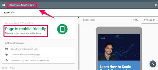
Thus, my suggestion is before you launch your site with a CTA, check manually on every device. You can do it manually by accessing your site from your cell phone or to make it faster, and you can utilize Google mobile-friendly test. It’s free & easy to use.
Rule 2: Accessible & Clickable CTAs
The second rule is, make your Call-to-action button clickable. What is the point of using a CTA when your audience can never click it, even if they wanted to do it?
I have seen many websites that weren’t able to make their CTAs accessible. Only because they put it in the wrong place. Now the question is, where should I put my CTA? Well, again, it’s a matter of debate.
It’s based on the type of website & audience you have. Let’s say you have an eCommerce website. Most of your audience is in buying mode when they visit your site. In that case, my suggestion is, you should showcase your CTA in front of the audience’s nose.
At the center or top of the page would be great to locate it perfectly. Also, do not forget to add some shadow behind the button; thus, your audience will be able to notice it more easily. Use some attractive words to catch the attention of viewers like “Show Now 40% Off”.
But, what if your website is a blog. You don’t sell anything. Well, in that case, you should showcase your CTA at the end or middle of the article. Remember, a blog & an eCommerce site is different. Do not use the same strategy for both. For a blog, try to be more reserved as your audience is not in buying mode.
Rule 3: Develop Your CTAs with New Trends
Keep in mind that, nowadays, we are in the ever-growing technology era. Your task should be keeping an eye on the new trend that emerges every day and keeps up with it.
If you don’t, then your competitors will beat you easily. For example, many people use their android phones to surf the web, and most of the time, they use voice commands to take action. The fact is, still, many websites are not even aware of this feature.
According to recent research, more than 4.2 billion users worldwide use voice commands to surf the web.
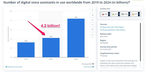
Make sure your website can take voice commands, especially your CTAs. If you do not know how to do it, I suggest using Google to learn more about it.
Rule 4: Make Sure Your CTAs Button Looks Like a Button
Sometimes even the slightest mistake can cause you a significant amount of damage if you are not careful enough. Let’s say you have done everything in the correct order. Your CTA is responsive; it looks attractive; it is visible & clickable as well. However, something goes wrong. It didn’t look like a button.
Yes, this is a huge mistake. Remember, around 55% of your visitors will skim your article; if you do not make your CTA look like a button, then worst-case scenario, most of your audience won’t even notice it.
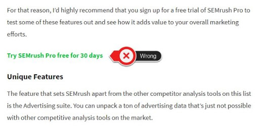

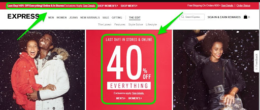
Take a look at the image above. Try to make your CTA look like the second one. As when your audience skims your article, it will be easier for them to notice it. So, your click-through rate will also increase.
Rule 5: Priorities CTAs Based on Performance
On a website, there could be several CTAs that exist based on topics and sections. However, you should focus on most performed CTAs, and other low performed CTAs should be removed.
Why is that? Because your audience is the priority. Do not overlook that. First, try to make them comfortable when reading an article or browse your site. You should keep your site clean and simple as much as possible.

Overloading with CTAs and banner & display ads will make your site look like spam, which will reduce the overall performance and reputation. If you overload your site with unnecessary banners & CTA, then even if your site has great quality content, it doesn’t matter. Your bounce rate will increase significantly.
Try to analyze which CTAs work best, then try to tweak it a bit to make it perform better. Then remove all other CTAs.
Rule 6: A Broad Description about CTAs
It is so obvious when you visit a site, and without much information, they ask you to click somewhere or download something; it is suspicious. Most of the time, people would think of spam, virus, or malware.
To make it work, you should display lots of relevant information to make your audience feel comfortable. If you can do that, then you won’t have to ask them to click; rather, they will find your CTA by themselves.
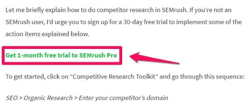

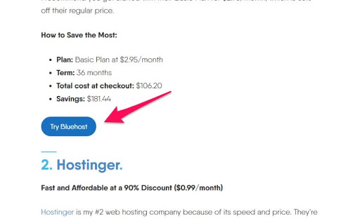
For example, take a look at the above image. This blog didn’t overload with lots of banner ads or CTAs. However, it asked the audience to click on this link to test out the service. I have checked this article; he asked six times in a single article, too much.
When you repeatedly see the exact line over & over, obviously, it will affect your mind negatively. Instead of clicking it, you will leave the site.
So, to make it right, you should place your CTA as a button at the end of your article or the beginning. Try to make your site clean, and surely your overall engagement will increase.
Rule 7: Size is Matter Based on Importance
When it comes to several contents on a page, make sure you prioritize them accordingly. For example, on your homepage, make sure the HeadlineHeadline is bigger than your Call-to-action button.
If you make CTAs bigger than the main Headline, then it will look unprofessional. The same goes for the product page. Your product headline should be the largest, the description should be smaller, and CTAs should be medium size to make it perfectly visible & clickable.
Rule 8: Make Call-to-action Visible to Audience Eyes
Finally, make sure it is visible to the audience’s eyes in a simple format. If you try to make it attractive with flashing lights and colors, it may sometimes work on the child audience; however, your adult buyer wouldn’t be interested at all; instead, they may feel disgusted about it.
Therefore, try to make it simple and informative instead of flashing color. Make sure it is easily visible and clickable with a simple format.
Roundups:
At the end of this article, let’s take a look at what we have learned. To get the best out of your Call-to-action button, follow the below rules.
- Make sure your site is responsive to all devices, especially check mobile devices with Google mobile-friendly tests.
- Make sure all CTAs are visible & clickable.
- Update your site with the latest voice command accessibility.
- Make your CTA look like a button to grab your audience’s attention.
- Test your CTAs performance & keep only the best-performing ones, do not overload with several CTAs; it will reduce your click-through rate instead of increasing.
- Do not use CTAs repeatedly over & over. Try to place it at the beginning or end of your article.
- Size always matters. Keep your CTA size reasonable; do not make it unnecessarily large.
- Try to make your CTA standard. Remember, flushing & exotic coloring won’t increase the performance.
Conclusion
Always remember this, most of the visitors skim the entire article to find useful information. They do not care how elaborately you explained.
They want to see the list & they will click on it & leave your site. If you have a large list, then they will bookmark it to return later. But, they are not going to read every text. Thus, if you can properly use CTA in your article, your click-through rate will increase significantly, no doubt about it.
Follow my guide & use these simple yet smart rules to utilize your CTAs & get the most out of it. I tried to make it as clear as possible, yet do not hesitate to leave a comment below if you need further help. I will try my best to solve your issue.